Tuesday, February 28, 2012

Hellebores - the annual temptation


I really love my brave little hellebores - they are out in this nasty weather blooming and
laughing at the snow. I sketched these blooms and bottles in my studio - trying to draw
loosely and largly from my shoulder, not my fingers and wrists.  This is a half sheet of hot pressed watercolor paper without any priming or stretching.
I have wanted to do a painting with a dark background for a while and this seemed like a good subject.


I also took lots of reference photos because hellebores nod and fade too quickly.


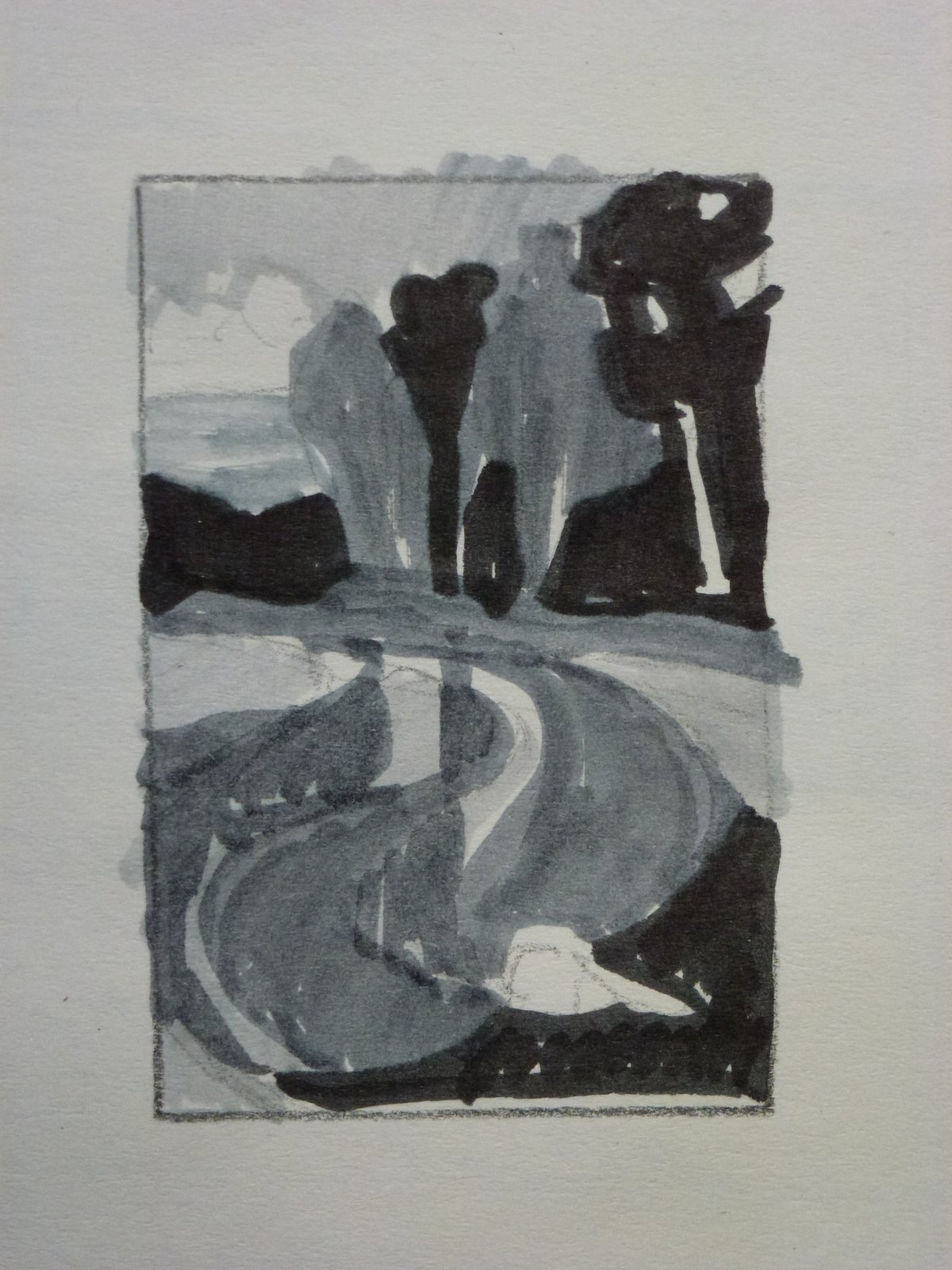
Continuing with my efforts to stay loose (is that an oxymoron?) I washed in large areas of dark,
medium, and light values with watercolor using a 1" round brush.


I don't know if I am finished with this painting...I tried so hard to remain loose, but the
fascinating pistals and stamens of my dainty hellebores and the light in the glass and on
the cloth drew me inexorably back into painting details. Argh, as Popeye would
say "I am what I am" I guess.  Leave your thoughts and comments please.
Posted by Picasa

Saturday, February 18, 2012

The Salt Marsh

The tide is out and the sun is setting - we live in such a dramatic place!
I have lots of reference photos of this tidal flat, so I look forward to
designing a painting using a limited palate of blues and their analagous colors.
Posted by Picasa

Monday, February 13, 2012

A friend suggests an improvement

February sunrise on 3 Crabs Pond
Remember this painting? I said I wasn't sure I was finished with it and I wasn't!

My friend Pat Star noticed that I had unintentionally created an arrow shape (with the reeds in the lower right) that directed the viewer's eye out of the picture frame. Since I want the viewer to stay in the picture frame, I took the point off the arrow and darkened the lower right corner to give it more weight. I was unhappy with the stacatto effect of these reeds too, so I grouped some of them to make stronger shapes and draw less attention to them.

Finally I added a band of ice blue on the right in the distance just to carry the idea of ice on the pond through the piece.


Posted by Picasa

August Evening on the Dungeness River


This is a notan - a Japanese word that refers to the simple beauty of a black, white, and gray value study. I made a little cardboard template with a 2" x 3" window so I can quickly draw a frame in my sketch book in which to compose several notans for each painting.


After I coated the 300# Arches watercolor paper with 2 coats of acrylic gesso and pumice, I blocked in the first layer of hard pastels.


Here I have washed the pastels with alcohol creating a loose under-painting.


On the left are the Nupastel sticks I have used - it's a narrow selection of colors and values but enough to 'tone' the paper.


Now I have added a second pass of Nupastel - using the same sticks really, but just refining the values and shapes.  Checking my notan, I see that I am fairly true to the value design I created.


Here is the finished painting...water is difficult to paint; moving water is VERY difficult to paint especially for a borderline OCD painter like me.

Posted by Picasa

Wednesday, February 8, 2012

Trying a new system


This week I am trying a system suggested by Duane Wakeham - one of my all-time favorite artists.
This is a half sheet of Arches cold pressed 300# watercolor paper. I have applied 2 coats of gesso with pumice and then tinted the surface with some oil paint diluted with turpentine. Next time I will tint with either watercolor or acrylic, this took a long time to dry and it's stinky!


I have blocked in the initial shapes with Nupastel.  Notice the ghost swans in the foreground - though they were initially intended to be the subject of the painting, I just couldn't bring myself to include them....they mess up the reflections with all their paddling around...maybe I'll try painting them again later.


I have washed the Nupastel with alcohol to create a loose underpainting. Next time I think I will underpaint with the darkest color in a given area, for instance I might underpaint the cattails on the left with a dark green brown.


I have laid  more Nupastel over the washes to re-define shapes.


Finally I changed to soft pastels for the greater range of colors and values. I like this step by step process and more to the point I like documenting it with the camera....that way I am not tempted to 'wing it' and get myself lost in the process.  I may not be finished with this painting, I will take another look at it with 'fresh eyes' in a few days.


Posted by Picasa

Saturday, February 4, 2012

Fall colors reflected


This is the first wash with some of my reference photos on the gatorboard.  Just blocking in the initial shapes here and trying VERY hard not to put in any detail.  Also, I am trying to merge shapes where possible and reminding myself that there will need to be lost edges.


A closer look at the initial washes all scribbly and casual - yeah!


Second pass with pastels, trying to lose some edges.  I am putting the darkest values underneath each area so when I 'turn on the lights' in the next pass these darker values will show through.


Final painting, I think....still studying this. There may be too much energy in the foreground which competes with my intended center of interest, the vine maple in it's fall colors.  Amazing how strong that ghost tree in the background turned out to be, may need to darken it and make it less straight.  This painting just won an honorable mention at the Sequim Arts annual juried show...not too bad, I get to buy more art supplies!
Posted by Picasa

Friday, February 3, 2012

Pastel over watercolor


This is the first wash of watercolor. I am trying to lay down the "underneath" colors of the stone, grass, trees and path.


Here is the completed painting, with a second, more detailed layer of watercolor and some spare applications of pastel. I love this old abbey in St. Remy de Provence.  It's where Van Gogh stayed in 1889 after he was released from the hospital in Arles.  Here he painted 150 works of the gardens and grounds of the asylum.  I'm no Van Gogh, but I enjoyed the surreal experience of painting what he painted. 
Posted by Picasa