Thursday, November 10, 2016

Mount Shuksan before Picture Lake a cooperative commissioned painting

Here is the fabulous reference photograph that my friend Laura Mackenzie took.

I chose to do the painting on a half sheet of 300# Arches watercolor paper.
I drew a simple line drawing indicating the big shapes.

I laid in the initial watercolor washes.

In the next painting session I added more watercolor to the under painting.

I laid in the pastel in the mountain and began adding the initial passes of dark pastel in the trees.


Some middle values added with pastels

The final painting after adjusting some details in the mountain and water.  
Finally, I added my signature as well as the name of the photographer Laura Mackenzie.


Thursday, November 3, 2016

Swinomish Channel

A simple line drawing just "eyeballing" the elements from a reference photo.

First watercolor wash over the whole page.

Darkening the mountains and the walls of the house.

The dark and medium washes; trying different colors of the same value in the large tree.

Darkening the values of the mountains and the house....then (gasp) I noticed that the house was too large and prominent, so I repainted the large shrub.  I darkened the value of the brown wall to black.

And then, "presto change-o" I added pastel over the watercolor primarily on the left side of the painting; leaving the watercolor washes in the sky,  most of the water, and the mountains untouched.  I may darken the house yet again to get it to 'sit back' in the tree shadow better.
There are three man made elements (the house, the pilings, and the two poles in front of the mountains) that pull the left side of the brain through the painting.  There are repeated color elements (blue house, blue mountains, blue water) that pull the right side of the brain around the painting.  I hope you enjoy painting Swinomish Channel as I did!


Saturday, October 29, 2016

Seed Heads in the Sunlight

A simple drawing of a local Sequim barn on Bell Bottom Road.

The two tone sky in a light wash.

premixed colors


Added the mountains and the dark, muted field grasses.

Painting large, variegated pieces of the barn.

Darkening and adding shapes to the foreground and adding details to the barn.

Adding vibrant trees behind the barn; started with raw umber and dropped in green and burnt sienna.

- and now the pastel -

Seed heads in the shade.


Seed heads in the sunlight!  I love to read comments.....so, leave one please.

Wednesday, October 26, 2016

FLowers, Glass bottle and California poppies

We covered quite a lot in class today - thanks to all of  you for your hard work, attention, and enthusiasm!  There is a lot of information in the blog today, so grab a cup of coffee or a glass of wine and kick back.

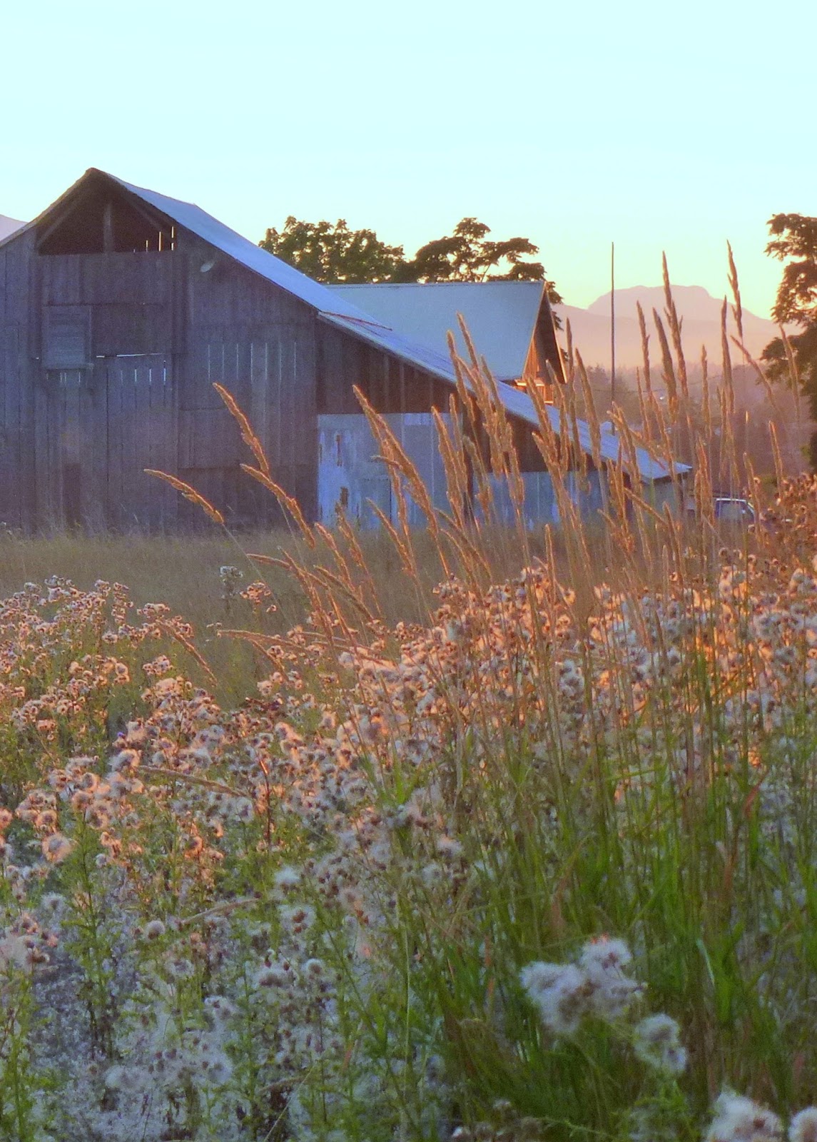
Here is the subject for this coming week - please come to class with this image drawn in pencil on your watercolor paper.  This is a more complex composition so we will need to get right to work and save the critique for last.  As always, give this a try if you would like to come to class with your own questions.


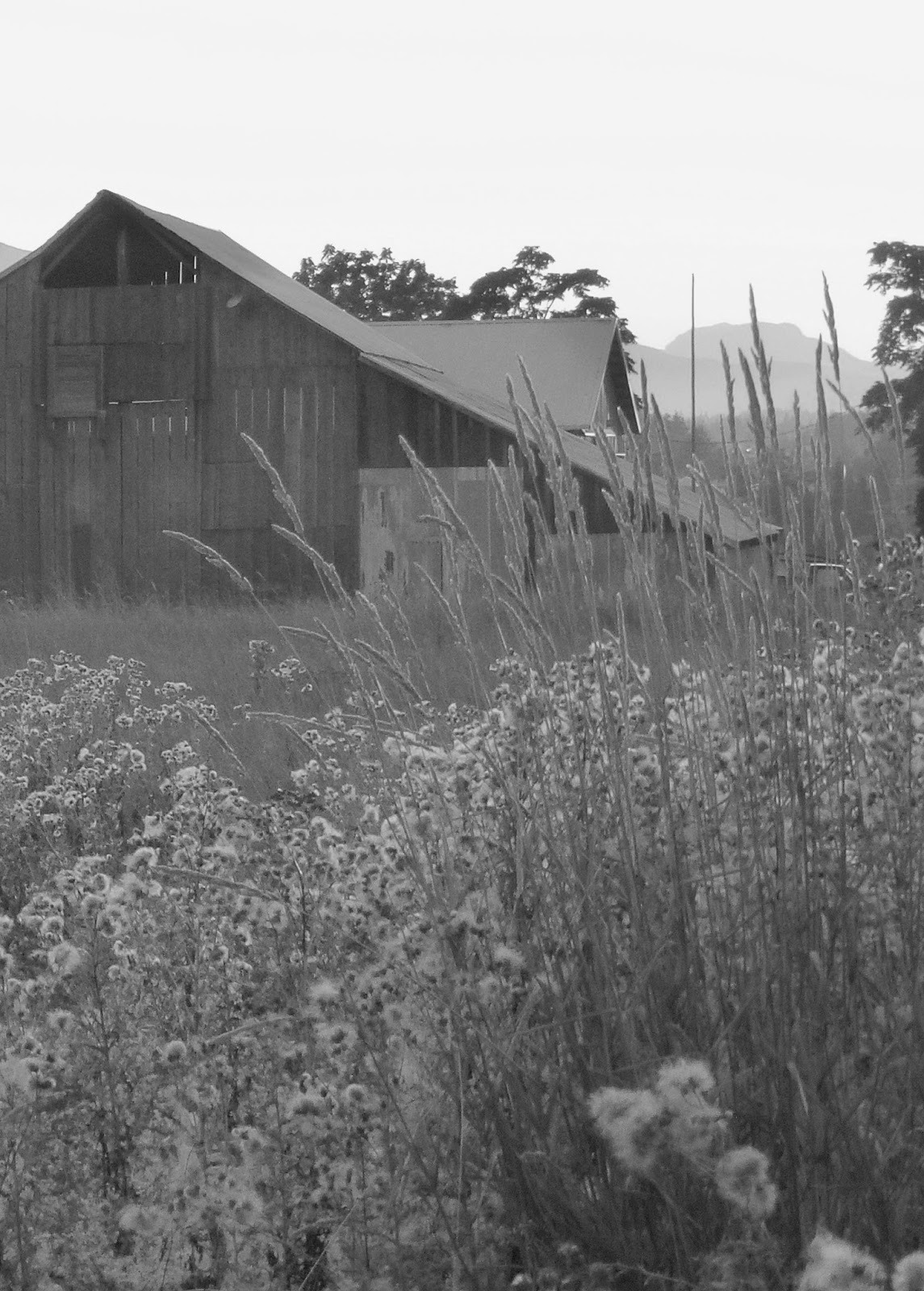
Here is the black and white reference for seeing the values clearly.


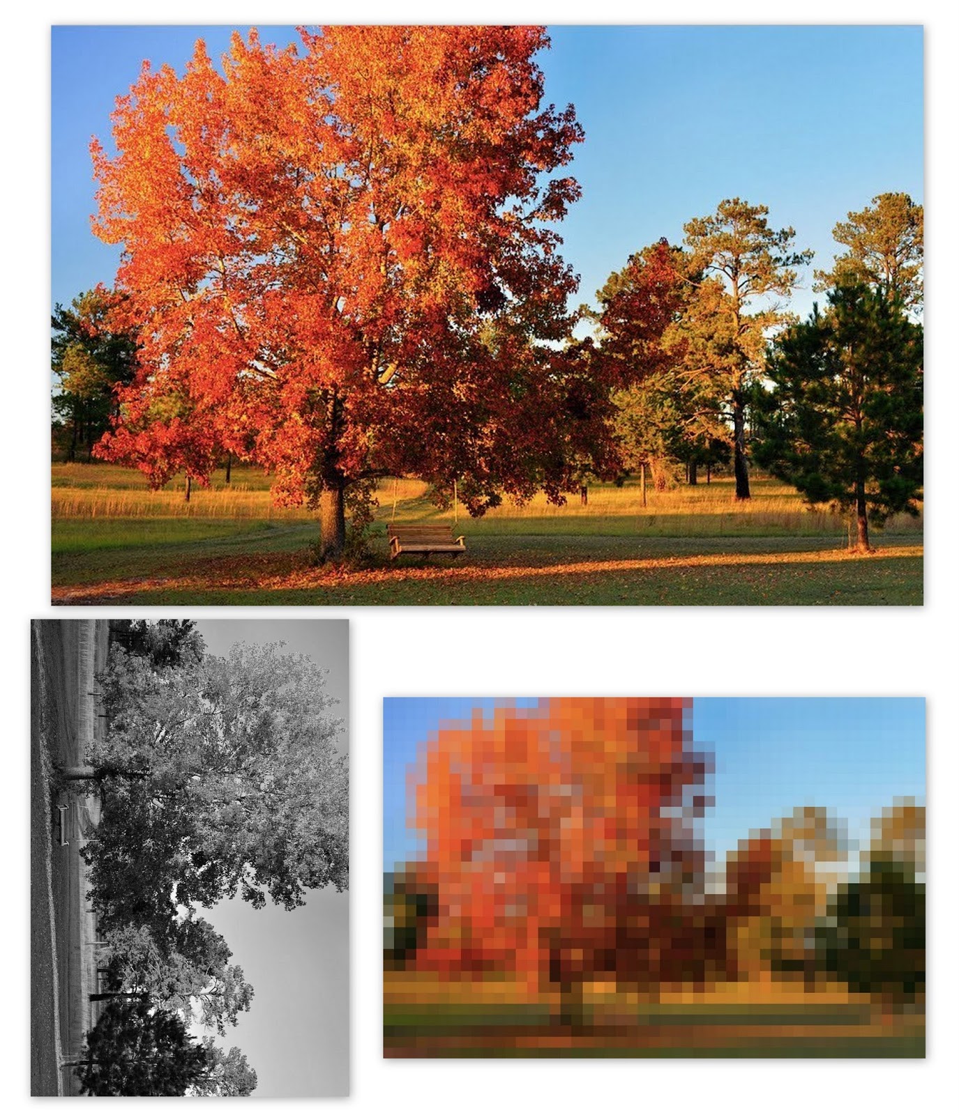
If you would like to try painting glass and flowers together, here's an image that will challenge you for sure (and make you wish you owned 1,000 pastels)!  Remember, think in values, and cool - vs- warm....and of course, DETAILS LAST!!  If you want a simpler challenge, zoom in on just one or two flowers.


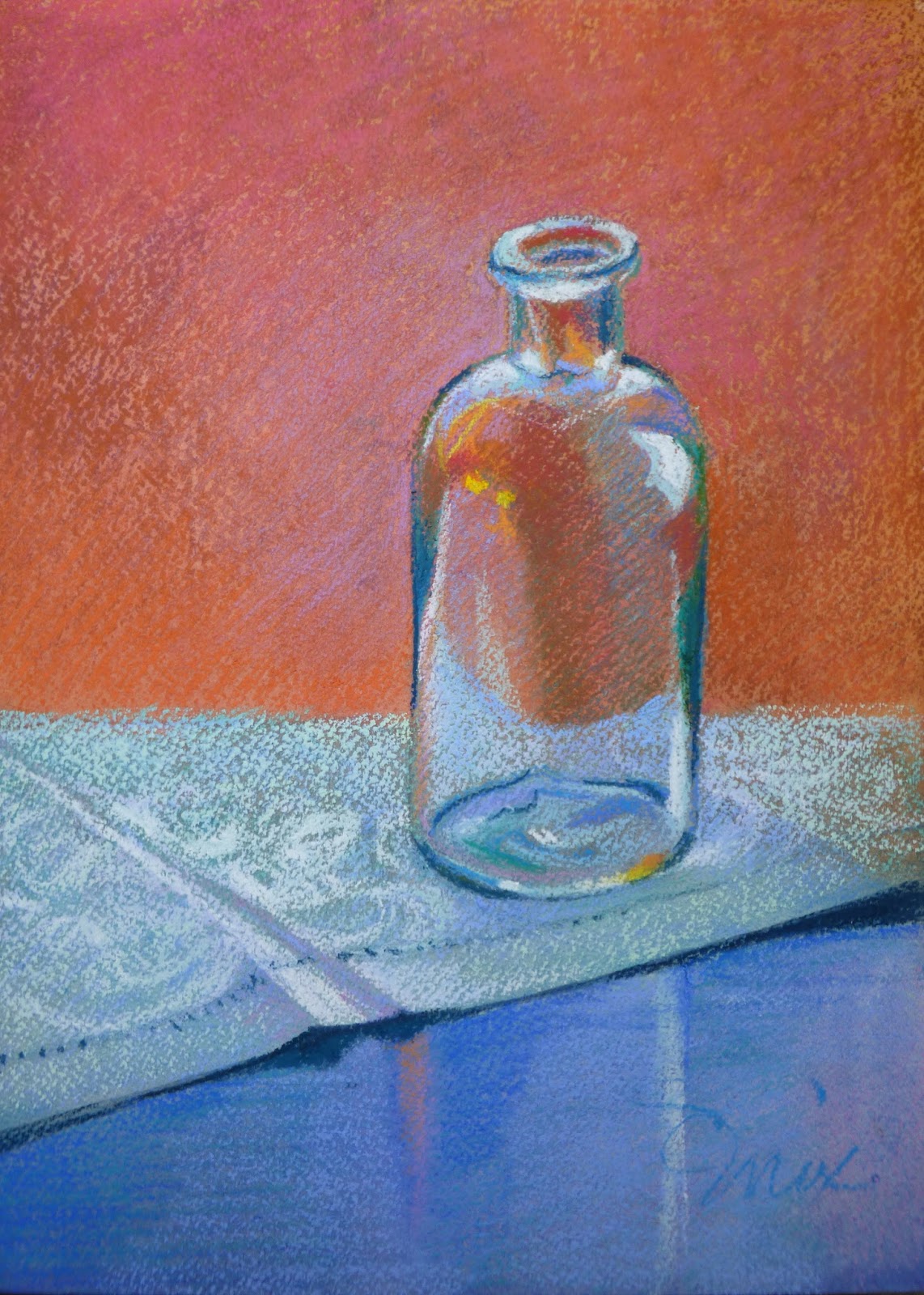
We had fun painting this simple glass bottle placed on a lovely linen.

First the watercolor under painting of large color shapes (no detail) in dark, neutralized colors.

Pastel was added to enhance the patterns of the fine linen tablecloth, the sheen of the table and of course the glass bottle.  As you can see, drafting skills are important....sadly, the bottle neck appears quite off kilter in my painting.  Take time to examine your drawing in a mirror to save yourself this problem.  There are 3 things make us humans assume we are seeing a glass object; the sparkle (highlight) the squiggle (distortions in the glass) and painting the background right through the glass shape.


We reviewed the process of a commissioned painting I just finished:

I did the initial drawing on 300# Arches with a hard, mid value pastel  as it would be easy to erase if the drawing wasn't accurate.

I then redrew the image with a firm pencil line that would be visible after the watercolor was applied.


I washed in the blue sky, lavender hills, tree and grasses working from top to bottom and from cool to warm.  In this image I have also begun to suggest the branch structure of the live oak tree.

I alternately stroked on cobalt blue, green blue, and blue violet pastels to suggest the brilliant blue California sky.  I also began to introduce pastels to the distant rolling hills indicating great swaths of poppies and grasses.  

I was struggling to make the tree colors dark and dense enough so I painted the dark brown and green pastels with clear water so they would melt into the paper - thereby filling the tooth of the paper with a dark, dense under painting.


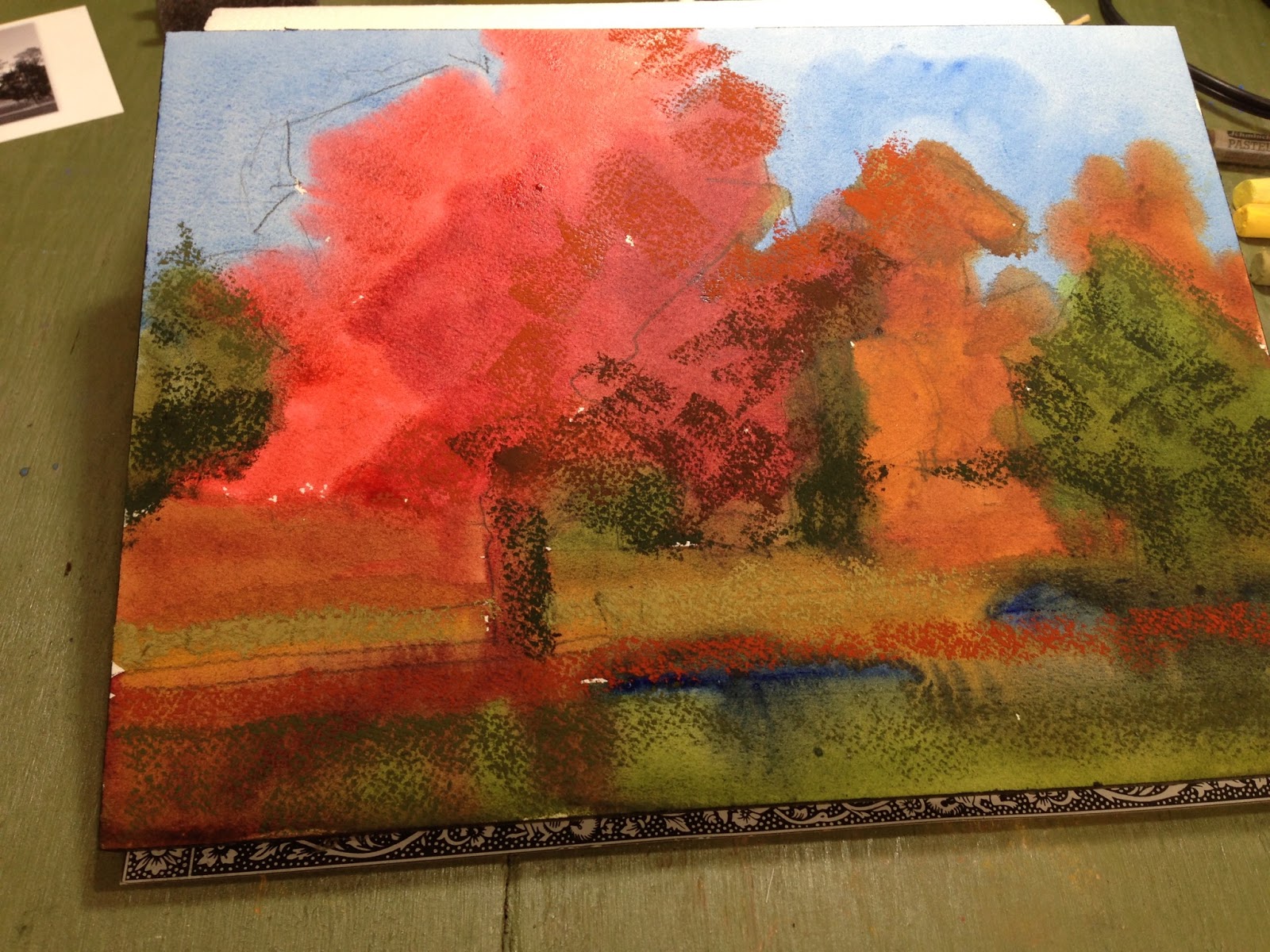
I added pastels to the tree and began to indicate the poppies and grasses in the foreground.

I added more sky holes and bits of the distant poppy fields to make the tree appear more airy.  I also broke up the too even rhythm of the undulating hills by joining the two nearest hills into one larger shape.


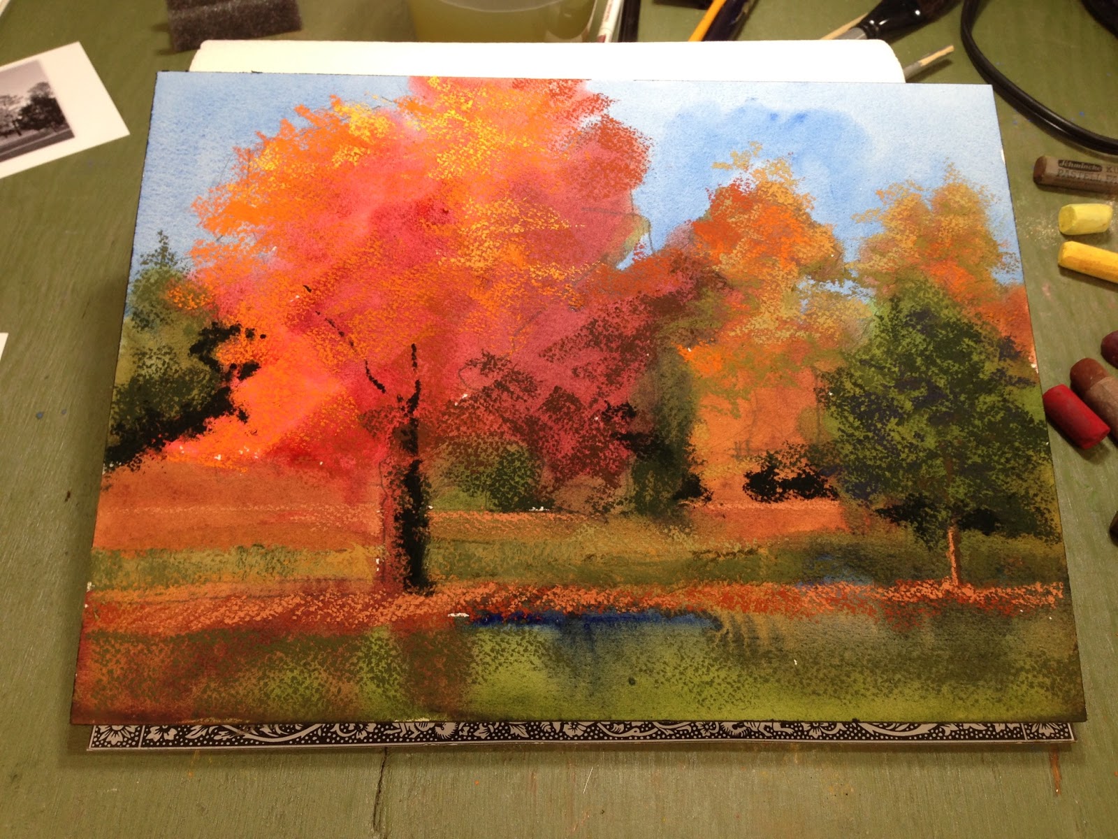
The foreground poppies lacked punch because the green under painting was showing through the red flowers and neutralizing them.  So, once again I used clear water to turn the red pastel into an under painting.  After the poppy shapes were dry I was able to add real brightness to the flower clusters.


Here is a close up of the newly under painted poppies.


Here is the finished painting "Lyrical Live Oak in a Sea of California Poppies"


Wednesday, October 19, 2016

Intermediate pastel over watercolor: Three reference photos


Hello painters,
I am so impressed with all the paintings you brought to class yesterday; it gladdens my heart to hear you say you couldn't wait to paint - that's EXACTLY how I feel about painting!  You are a bunch of go-getters and I am having a blast painting with you!

Yesterday we created a vibrant pastel painting of fall trees and grasses with a watercolor under painting.


From my original image I created 2 additional reference images a black and white 'value finder' and a pixilated 'large shapes finder' (all three images were printed on one sheet of paper which is why the B&W is vertical).

I use these two altered reference photos for the simplified drawing, the watercolor under painting, and initial pastel block in.  I keep the original photo face down on my desk until it's time to add the details.  This practice keeps me focused on large shapes and large value patterns when it really counts, in the beginning of the painting process!


Painting large dark shapes color-next-to-color (so there are no hard edges) with a size 16 round brush.


Very loose drawing indicating big value shapes.  I used a firm pencil line so it will be visible after the watercolor is applied.


Beginning to lay in darkest pastel passages after the watercolor is dry.


Adding medium and then light values in pastel.  Pushing branches and 'leaves' into the sky.


Adding more depth of colors and some large details, allowing watercolor to show through.


Last pass I add the lightest lights and the details such as 'sky holes' and sunlight on tree trunks.  I will lightly fix the pastel before carefully cutting the watercolor paper off the block.


Thank you to Liz Bumgarner for the photos!


Next week we will work on the small still life (below) with one glass object, I have created all three reference images for you, please print them out and bring them to class with you along your pencil drawing on a 9" x 12" watercolor paper.  

As always, if you have the time, I encourage you to "try painting it at home first" so you will come to class with specific questions and therefore will get much more out of the class.  

If the image isn't to your liking, you may substitute your own composition, but KEEP IT SIMPLE please!

Thank you and I'll see you on Tuesday!