Thursday, September 25, 2014

Sunrise on the ponds along Three Crabs Road


On the left is the small thumbnail value sketch I used for designing the painting.  I am working on Kitty Wallis museum grade sanded paper 9" x 12"

I used hard pastels to block in the main shapes.  I then washed the painting down (one color at a time) with alcohol to create an underpainting.

I blocked in the large shapes with the darkest value I see in each shape.

I layered on mid and finally light values.

The finished piece is actually a little darker and more nuanced than this image, it's tough to photograph pastel accurately.

Saturday, July 19, 2014

Down the Colorado III


This is the third in a series of paintings from our trip down the Colorado river in May.


Here are some of the paints I mixed for the washes.


After a fairly careful drawing, I began by painting wet in wet passages that were not too large; I needed to be able to stroke in some middle values into the light colored washes.


After all the lightest juicy passages were complete I began darkening and defining the background.
Then the middle ground.
And finally the foreground.
As always, I am a little too exuberant with vibrant colors so after I laid in the secondary washes in the river, I waited a few days to see the painting with fresh eyes.
Down the Colorado III
The River water needed a third layer of paint to add more of the warm reflected colors and to darken the deep water on the right.


As I suspected, the rock formations in the near ground were WAY too bright and the contrast of detail was distracting from the painting's focal point.  When my friend Pat Starr came by, we discussed how to unify, calm, and darken the rock formations on the right.  I washed over them with a greyed lavender wash and while it was wet I dropped in some drab greens too; much better!  Finally I added some sparkling ripples in the water with a touch of colored pencil.  I hope you enjoy
Down the Colorado III

Sunday, June 15, 2014

Clair Quist master boatman

I am about to send this painting to my new friend Clair Quist.  He was the wise, funny, capable, patient, helpful, sweet natured man who, along with his swamper Simone and their friend Cody, safely (yet thrillingly) navigated our 35' raft 222 miles down the Colorado River through the Grand Canyon.  What a thrill and a joy it was for Tom and I to make this trip with these lovely people.

This is the finished 12" x 16" watercolor painting and here's how I did it:

I made a fairly detailed drawing on 140# Arches and then used resist to hold a few of the white areas in the brim of the hat and around the mustache.

I laid in the background wet in wet in light values.

Next I laid in the initial washes in the figure.

Here I have begun to add some of the mid and dark values and suggested his eyes behind the tinted glasses.  I rubbed off the resist and softened some of the lines it had left.
Finally I added a little more interest in the background and added the all important hat strings...no hat strings, no hat!  If you click on the picture to see the detail you will see that I had to enlarge the glasses and then I put some warm colors in his skin tones with colored pencil.  I wasn't able to add more washes to his face with watercolor because the earlier washes were lifting off the paper.  

.

Sunday, May 25, 2014


We just got back home and unpacked from our best trip yet; rafting down the Colorado River through Grand Canyon.  

Every inch of the 222 miles of the river was fascinating with changing light, color, shapes, and moving water.

I only took 950 pictures because my camera wasn't waterproof, Tom took the other 1,240 pictures!

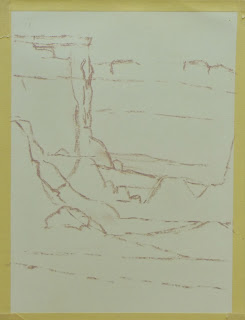
Here is the first wash - it's tough to gauge the values correctly...so I went with warm and cool colors and just jumped in.


Trying to use as little detail as possible, I layered in the bands of rock and color on the left hand side.

Finally addressing the dark bands of desert varnish in the foreground rocks and layering in washes in the water.


I think I will paint this again next week using pastel.  This scene may be easier because I will be able to work from dark to light and since the pastels are wider than a watercolor brush I may be able to resist painting so much of the detail in the distance.  I learned a lot (though not enough) about painting the canyon walls from Cody DeLong take a look at his website www.codydelong.com to see how it should be done.  Maybe when I have a little more distance from this exhilarating experience I will be able to resist the urge to explain it ALL to the viewer...so stay tuned, more pieces next week!

Sunday, January 12, 2014

Practicing Red Rock painting

Tom and I are going to raft the Colorado river in May on a plein air painting trip so I am trying to simplify my painting process and palette.  First I need to take smaller bites; I really liked this reference photo but since I will be working on 9 x 12 wallis paper, there's no way I can do that much detail.

So I cropped the photo to find the most interesting shapes, evocative colors and interesting angles.

I sketched in the large shapes on Kitty Wallis sanded paper taped to foam core


Using a small Winsor Newton travel set of watercolors I washed on the loose under painting.  As I watched the paper buckle I realized I will need to mount all the paper onto foam core before we leave.

Here's the painting...not horrible though I should have made the back wall of the canyon cooler so it would sit back better....well, that's one down and a couple dozen to go.  I hope to have a lot of fine small paintings to sell when I get home - so I can afford the next trip!

I have wanted to paint grapes for a while, they are such little jewels!

The sketch on the rough side of Canson Mi-Teintes with vine charcoal which I brushed down before adding pastel.

stroking on dark and mid value pastels

I have blended the pastels so they become an under painting of sorts

I begin to add details working left to right and top to bottom


This is the fun part, firing up the grapes!

I add the darkest darks and the lightest lights and sign it but I'm going to look at it tomorrow with 'fresh eyes'.

The next day I added blues to the onion and peachy warm tones to the grapes - they were all too equally red yesterday.  I also stroked more warm toasty pastel over the pale violet in the upper right area that was too distracting.  Finally I noticed that since they are translucent, the grapes cast a warm glow on the beige fabric - just the right touch I now think!


Demonstration painting pears with pastel

These pears have been bumped a bit, but with a strong light and a good imagination they will do.

I am recycling a gently used piece of Kitty Wallis Belgian mist sanded paper 9 x 12.  I begin the painting with a sketch done with vine charcoal.  I brushed the sketch with an old oil painting brush to remove most of the charcoal so it won't darken the pastels.

I have blocked in large shapes with light, mid and fairly dark values.  I will add the lightest values at the end.

The finished piece isn't this garish.  Please click on the image so you can examine the pastel strokes more closely.  After a while I stroked the lightest peach pastel over the lavender area on the far right....there was just too much interest in the contrast between the background and tablecloth where they meet.